Introduction:
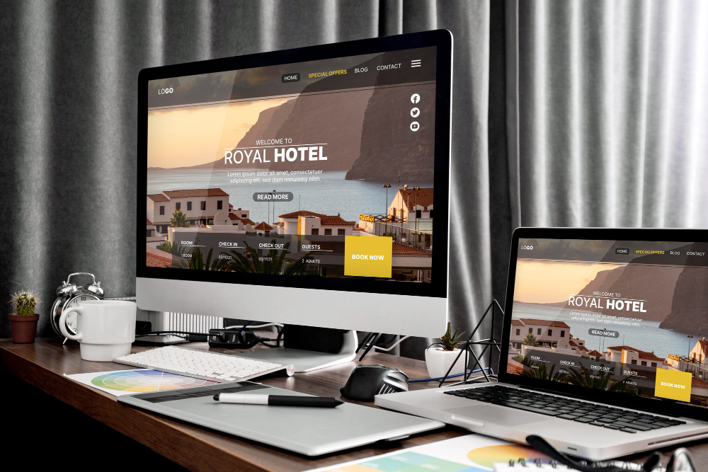
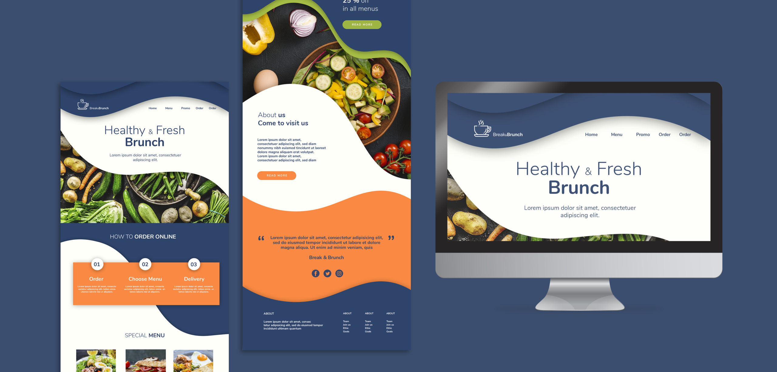
In today’s digital landscape, where screens of various sizes and devices dominate, creating responsive websites has become paramount. As users expect seamless experiences across desktops, tablets, and smartphones, web developers must master the art of building responsive websites. In this comprehensive guide, we will delve into the enchanting world of CSS media queries—a powerful tool that allows us to craft visually captivating and adaptable websites for users across all devices.
1. Understanding Responsive Design
To embark on our journey, it is crucial to comprehend the foundations of responsive design. We will explore the principles that underpin this approach, emphasizing the importance of fluid layouts and flexible elements. By creating websites that seamlessly adapt to different screen sizes and orientations, we ensure a consistent and engaging experience for all users.
2. Unveiling the Power of CSS Media Queries
CSS media queries serve as our guide in this adventure. We will unravel their magical capabilities, enabling us to conditionally apply styles based on screen characteristics. Delving into the syntax and structure of media queries, we will learn how to harness their potential to target specific devices, resolutions, and even user preferences.
/* Example of a media query targeting small screens */
@media screen and (max-width: 600px) {
/* CSS rules for small screens */
}
3. Implementing Responsive Breakpoints
One of the key aspects of building responsive websites is understanding breakpoints. We will explore their significance and learn how to strategically place them within our CSS code. By defining breakpoints, we can gracefully adapt the design and rearrange content to optimize user experiences at various screen sizes.
/* Example of a breakpoint for a tablet-sized screen */
@media screen and (min-width: 768px) and (max-width: 1024px) {
/* CSS rules for tablet-sized screens */
}\
4. Crafting Adaptive Layouts and Typography
Responsive design is not just about fitting content into different screens—it’s about creating a harmonious visual experience. We will delve into techniques for crafting adaptive layouts, including flexible grids and fluid typography. By utilizing CSS properties like max-width and em-based units, we can create visually pleasing designs that scale elegantly across devices.
/* Example of flexible grid layout using CSS Grid */
.container {
display: grid;
grid-template-columns: repeat(auto-fit, minmax(250px, 1fr));
gap: 20px;
}
/* Example of fluid typography using viewport units */
h1 {
font-size: calc(24px + 1vw);
}
5. Testing and Debugging for Cross-Device Compatibility
Building responsive websites requires thorough testing and debugging. We will explore tools and techniques to ensure cross-device compatibility. From browser developer tools to device emulators, we will discover methods to validate and fine-tune our designs, ensuring a seamless experience for users across a multitude of devices.
<!– Example of responsive image using srcset attribute –>
<img srcset=”image-large.jpg 1200w,
image-medium.jpg 800w,
image-small.jpg 400w”
sizes=”(max-width: 600px) 100vw,
(max-width: 1200px) 50vw,
25vw”
src=”image-default.jpg” alt=”Responsive Image”>
Conclusion
With the power of CSS media queries in our grasp, we have the tools to transform our websites into adaptable, captivating experiences. By embracing responsive design principles, understanding breakpoints, and crafting adaptive layouts, we can create websites that.


